Parallel Coordinate Plots
Parallel coordinate plots are one way to visualise data relationships and clusters in higher dimensional data. pyrolite now includes an implementation of this which allows a handy quick exploratory visualisation.
import matplotlib.axes
import matplotlib.pyplot as plt
from mpl_toolkits.axes_grid1 import make_axes_locatable
import numpy as np
import pandas as pd

import pyrolite.data.Aitchison
import pyrolite.plot
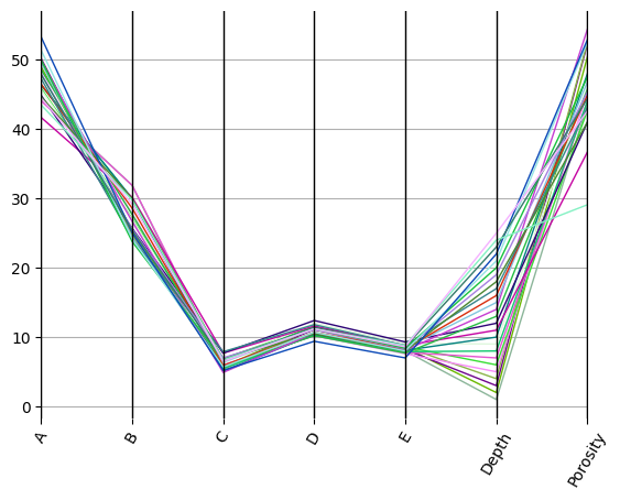
To start, let’s load up an example dataset from Aitchison
df = pyrolite.data.Aitchison.load_coxite()
comp = [
    i for i in df.columns if i not in ["Depth", "Porosity"]
]  # compositional data variables
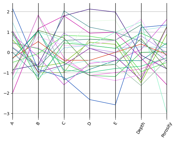
By rescaling this using the mean and standard deviation, we can account for scale differences between variables:
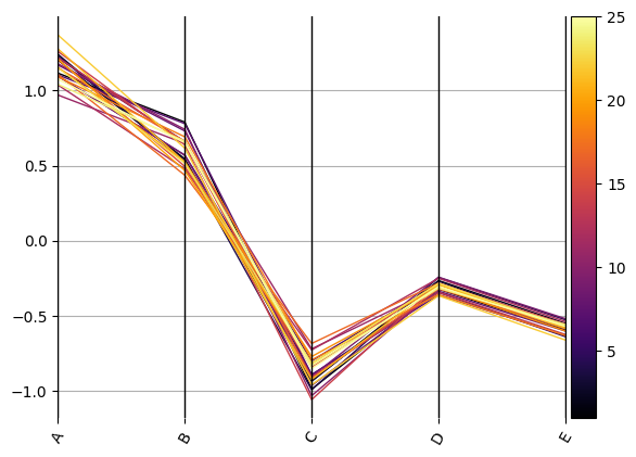
We can also use a centred-log transform for compositional data to reduce the effects of spurious correlation:
from pyrolite.util.skl.transform import CLRTransform

cmap = "inferno"
compdata = df.copy()
compdata[comp] = CLRTransform().transform(compdata[comp])
ax = compdata.loc[:, comp].pyroplot.parallel(color=compdata.Depth.values, cmap=cmap)
divider = make_axes_locatable(ax)
cax = divider.append_axes("right", size="5%", pad=0.05)

# we can add a meaningful colorbar to indicate one variable also, here Depth
sm = plt.cm.ScalarMappable(cmap=cmap)
sm.set_array(df.Depth)
plt.colorbar(sm, cax=cax, orientation="vertical")
plt.show()
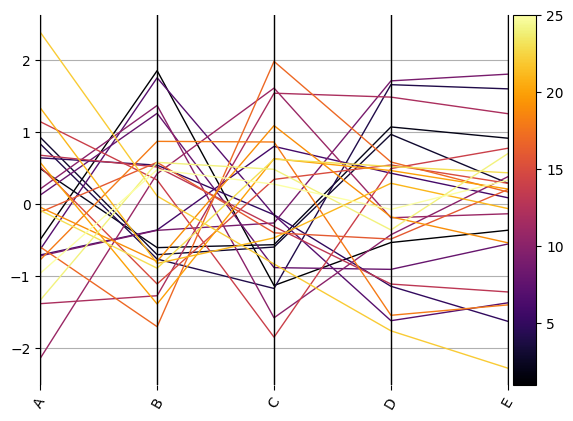
ax = compdata.loc[:, comp].pyroplot.parallel(
    rescale=True, color=compdata.Depth.values, cmap=cmap
)
divider = make_axes_locatable(ax)
cax = divider.append_axes("right", size="5%", pad=0.05)
plt.colorbar(sm, cax=cax, orientation="vertical")
plt.show()
Total running time of the script: (0 minutes 0.370 seconds)