Density and Contour Plots
While individual point data are useful, we commonly want to understand the the distribution of our data within a particular subspace, and compare that to a reference or other dataset. Pyrolite includes a few functions for visualising data density, most based on Gaussian kernel density estimation and evaluation over a grid. The below examples highlight some of the currently implemented features.
import matplotlib.pyplot as plt
import numpy as np
import pandas as pd

from pyrolite.comp.codata import close
from pyrolite.plot import pyroplot
from pyrolite.plot.density import density


np.random.seed(82)
First we create some example data :
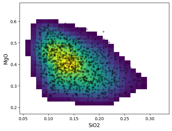
A minimal density plot can be constructed as follows:
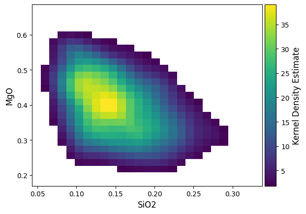
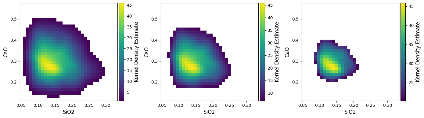
A colorbar linked to the KDE estimate colormap can be added using the colorbar boolean switch:
density by default will create a new axis, but can also be plotted over an existing axis for more control:
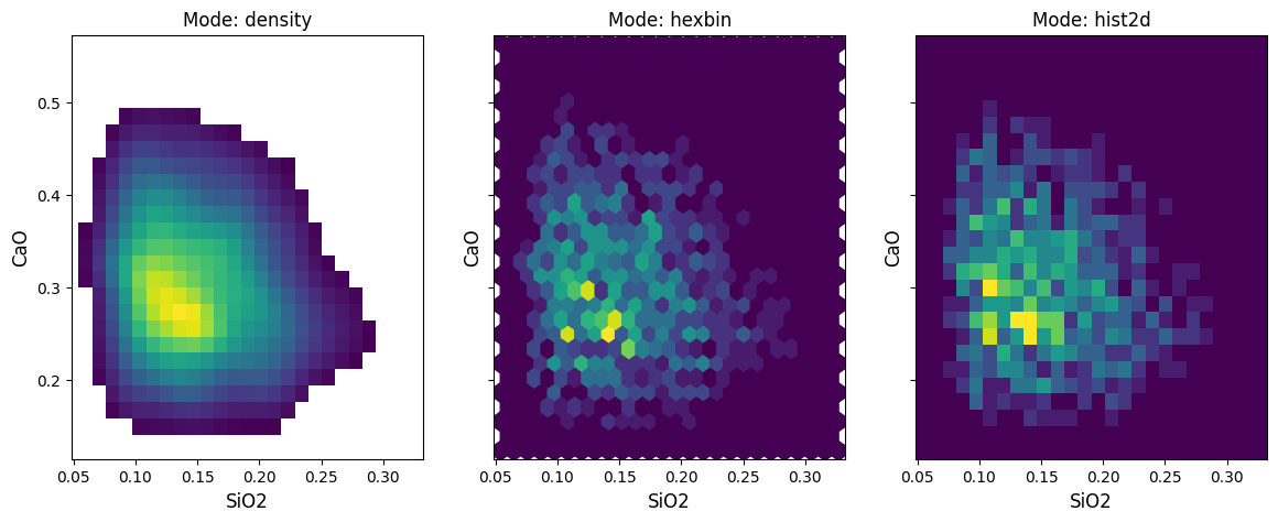
There are two other implemented modes beyond the default density: hist2d and hexbin, which parallel their equivalents in matplotlib. Contouring is not enabled for these histogram methods.
For the density mode, a vmin parameter is used to choose the lower
threshold, and by default is the 99th percentile (vmin=0.01), but can be
adjusted. This is useful where there are a number of outliers, or where you wish to
reduce the overall complexity/colour intensity of a figure (also good for printing!).
plt.close("all") # let's save some memory..
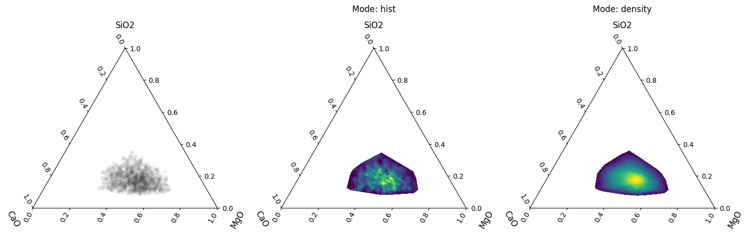
Density plots can also be used for ternary diagrams, where more than two components are specified:
fig, ax = plt.subplots(
    1,
    3,
    sharex=True,
    sharey=True,
    figsize=(15, 5),
    subplot_kw=dict(projection="ternary"),
)
df.loc[:, ["SiO2", "CaO", "MgO"]].pyroplot.scatter(ax=ax[0], alpha=0.05, c="k")
for a, mode in zip(ax[1:], ["hist", "density"]):
    df.loc[:, ["SiO2", "CaO", "MgO"]].pyroplot.density(ax=a, mode=mode)
    a.set_title("Mode: {}".format(mode), y=1.2)

plt.tight_layout()
plt.show()
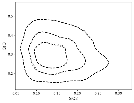
Contours are also easily created, which by default are percentile estimates of the underlying kernel density estimate.
Note
As the contours are generated from kernel density estimates, assumptions around e.g. 95% of points lying within a 95% contour won’t necessarily be valid for non-normally distributed data (instead, this represents the approximate 95% percentile on the kernel density estimate). Note that contours are currently only generated; for mode=”density”; future updates may allow the use of a histogram basis, which would give results closer to 95% data percentiles.
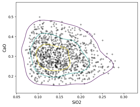
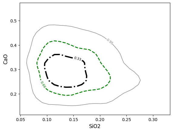
You can readily change the styling of these contours by passing cmap (for different colormaps), colors (for bulk or individually specified colors), linewidths and linestyles (for bulk or individually specified linestyles). You can also use ‘label_contours=False` to omit the contour labels. For example, to change the colormap and omit the contour labels:
You can specify one styling value for all contours:
Or specify a list of values which will be applied to the contours in the order given in the contours keyword argument:
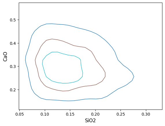
If for some reason the density plot or contours are cut off on the edges, it may be that the span of the underlying grid doesn’t cut it (this is often the case for just a small number of points). You can either manually adjust the extent ( extent = (min_x, max_x, min_y, max_y) ) or adjust the coverage scale ( e.g. coverage_scale = 1.5 will increase the buffer from the default 10% to 25%). You can also adjust the number of bins in the underlying grid (either for both axes with e.g. bins=100 or individually with bins=(<xbins>, <ybins>)):
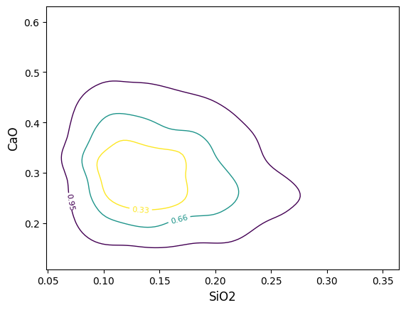
/home/docs/checkouts/readthedocs.org/user_builds/pyrolite/checkouts/main/pyrolite/util/plot/density.py:203: UserWarning: The following kwargs were not used by contour: 'coverage_scale'
  cs = contour(
Geochemical data is commonly log-normally distributed and is best analysed and visualised after log-transformation. The density estimation can be conducted over logspaced grids (individually for x and y axes using logx and logy boolean switches). Notably, this makes both the KDE image and contours behave more naturally:
# some assymetric data
from scipy import stats

xs = stats.norm.rvs(loc=6, scale=3, size=(200, 1))
ys = stats.norm.rvs(loc=20, scale=3, size=(200, 1)) + 5 * xs + 50
data = np.append(xs, ys, axis=1).T
asym_df = pd.DataFrame(np.exp(np.append(xs, ys, axis=1) / 25.0))
asym_df.columns = ["A", "B"]
grids = ["linxy", "logxy"] * 2 + ["logx", "logy"]
scales = ["linscale"] * 2 + ["logscale"] * 2 + ["semilogx", "semilogy"]
labels = ["{}-{}".format(ls, ps) for (ls, ps) in zip(grids, scales)]
params = list(
    zip(
        [
            (False, False),
            (True, True),
            (False, False),
            (True, True),
            (True, False),
            (False, True),
        ],
        grids,
        scales,
    )
)
fig, ax = plt.subplots(3, 2, figsize=(8, 8))
ax = ax.flat

for a, (ls, grid, scale) in zip(ax, params):
    lx, ly = ls
    asym_df.pyroplot.density(ax=a, logx=lx, logy=ly, bins=30, cmap="viridis_r")
    asym_df.pyroplot.density(
        ax=a,
        logx=lx,
        logy=ly,
        contours=[0.95, 0.5],
        bins=30,
        cmap="viridis",
        fontsize=10,
    )
    asym_df.pyroplot.scatter(ax=a, s=10, alpha=0.3, c="k", zorder=2)

    a.set_title("{}-{}".format(grid, scale), fontsize=10)
    if scale in ["logscale", "semilogx"]:
        a.set_xscale("log")
    if scale in ["logscale", "semilogy"]:
        a.set_yscale("log")
plt.tight_layout()
plt.show()
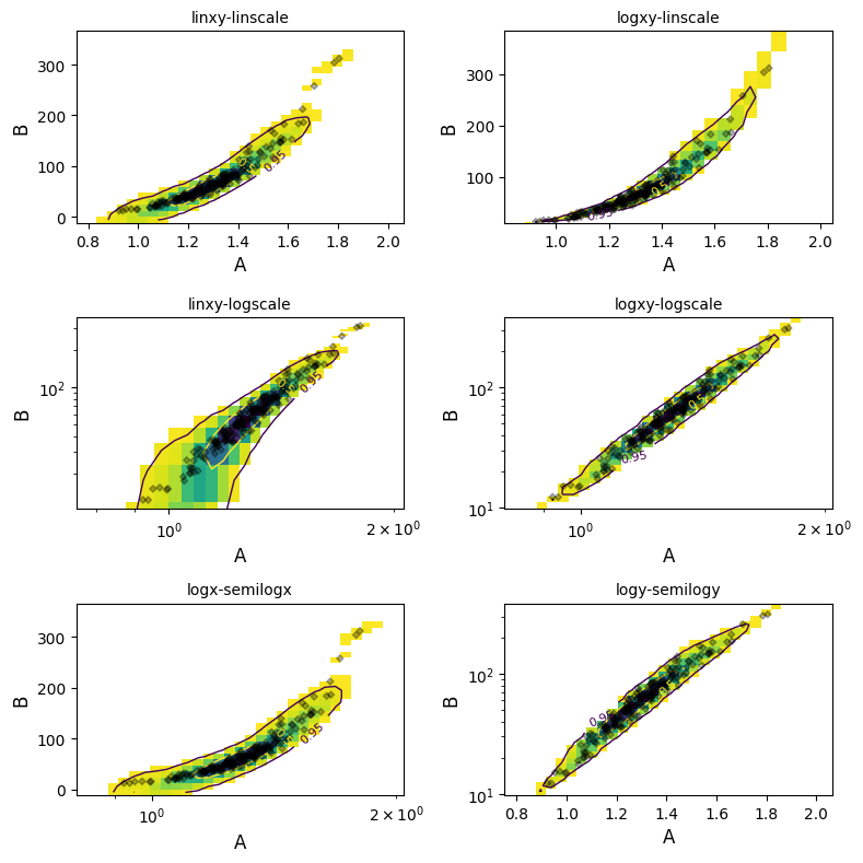
plt.close("all") # let's save some memory..
Note
Using alpha with the density mode induces a known and old matplotlib bug,
where the edges of bins within a pcolormesh image (used for plotting the
KDE estimate) are over-emphasized, giving a gridded look.
Total running time of the script: (0 minutes 3.062 seconds)