Using Manifolds for Visualisation
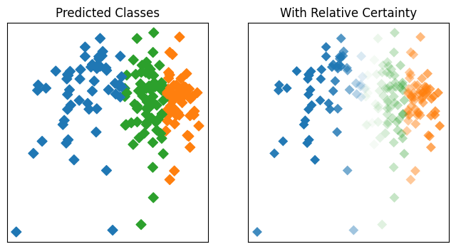
Visualisation of data which has high dimensionality is challenging, and one solution
is to provide visualisations in low-dimension representations of the space actually
spanned by the data. Here we provide an example of visualisation of classification
predictions and relative prediction certainty (using entropy across predicted
probability for each individual class) for a toy sklearn dataset.
import matplotlib.pyplot as plt
import numpy as np
import sklearn.datasets

from pyrolite.util.plot import DEFAULT_DISC_COLORMAP
from pyrolite.util.skl.pipeline import SVC_pipeline
from pyrolite.util.skl.vis import plot_mapping

np.random.seed(82)
# data = data[:, np.random.random(data.shape[1]) > 0.4] # randomly remove fraction of dimensionality
Fitting 10 folds for each of 1 candidates, totalling 10 fits
fig, ax = plt.subplots(1, 2, figsize=(8, 4))

a, tfm, mapped = plot_mapping(data, gs.best_estimator_, ax=ax[1], s=50, init="pca")
ax[0].scatter(*mapped.T, c=DEFAULT_DISC_COLORMAP(gs.predict(data)), s=50)

ax[0].set_title("Predicted Classes")
ax[1].set_title("With Relative Certainty")

for a in ax:
    a.set_xticks([])
    a.set_yticks([])
Total running time of the script: (0 minutes 3.162 seconds)