Formatting and Cleaning Up Plots
Note
This tutorial is a work in progress and will be gradually updated.
In this tutorial we will illustrate some straightfoward formatting for your plots which
will allow for greater customisation as needed. As pyrolite heavily uses
and exposes the API of matplotlib for the visualisation components
(and also mpltern for ternary diagrams), you should also check out their
documentation pages for more in-depth guides, examples and API documentation.
First let’s pull in a simple dataset to use throughout these examples:
from pyrolite.util.synthetic import normal_frame


df = normal_frame(columns=["SiO2", "CaO", "MgO", "Al2O3", "TiO2", "27Al", "d11B"])
Basic Figure and Axes Settings
matplotlib makes it relatively straightfoward to customise most settings for
your figures and axes. These settings can be defined at creation (e.g. in a call to
subplots()), or they can be defined after you’ve created an
axis (with the methods ax.set_<parameter>()). For example:
import matplotlib.pyplot as plt

fig, ax = plt.subplots(1)

ax.set_xlabel("My X Axis Label")
ax.set_title("My Axis Title", fontsize=12)
ax.set_yscale("log")
ax.set_xlim((0.5, 10))

fig.suptitle("My Figure Title", fontsize=15)

plt.show()
You can use a single method to set most of these things:
set(). For example:
import matplotlib.pyplot as plt

fig, ax = plt.subplots(1)
ax.set(yscale="log", xlim=(0, 1), ylabel="YAxis", xlabel="XAxis")
plt.show()
Labels and Text
matplotlib enables you to use \(\TeX\) within all text elements, including
labels and annotations. This can be leveraged for more complex formatting,
incorporating math and symbols into your plots. Check out the mod:matplotlib
tutorial, and
for more on working with text generally in matplotlib, check out the
relevant tutorials gallery.
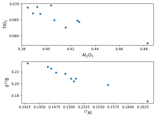
The ability to use TeX syntax in matplotlib text objects can also be used
for typsetting, like for subscripts and superscripts. This is particularly relevant
for geochemical oxides labels (e.g. Al2O3, which would ideally be rendered as
\(Al_2O_3\)) and isotopes (e.g. d11B, which should be \(\delta^{11}B\)).
At the moment, pyrolite won’t do this for you, so you may want to adjust the labelling
after you’ve made them. For example:
import pyrolite.plot
import matplotlib.pyplot as plt

fig, ax = plt.subplots(2, 1)
df[["Al2O3", "TiO2"]].pyroplot.scatter(ax=ax[0])
ax[0].set_xlabel("Al$_2$O$_3$")
ax[0].set_ylabel("TiO$_2$")

df[["27Al", "d11B"]].pyroplot.scatter(ax=ax[1])
ax[1].set_xlabel("$^{27}$Al")
ax[1].set_ylabel("$\delta^{11}$B")

plt.tight_layout()  # rearrange the plots to fit nicely together
plt.show()
/home/docs/checkouts/readthedocs.org/user_builds/pyrolite/checkouts/develop/docs/source/gallery/tutorials/plot_formatting.py:79: SyntaxWarning: invalid escape sequence '\d'
  ax[1].set_ylabel("$\delta^{11}$B")
Sharing Axes
If you’re building figures which have variables which are re-used, you’ll typically
want to ‘share’ them between your axes. The matplotlib.pyplot API makes
this easy for when you want to share among all the axes as your create them:
import matplotlib.pyplot as plt

fig, ax = plt.subplots(2, 2, sharex=True, sharey=True)
plt.show()
However, if you want to share axes in a way which is less standard, it can be
difficult to set up using this function. pyrolite has a utility function
which can be used to share axes after they’re created in slightly more arbitrary
ways. For example, imagine we wanted to share the first and third x-axes, and the
first three y-axes, you could use:
import matplotlib.pyplot as plt
from pyrolite.util.plot.axes import share_axes

fig, ax = plt.subplots(2, 2)
ax = ax.flat  # turn the (2,2) array of axes into one flat axes with shape (4,)
share_axes([ax[0], ax[2]], which="x")  # share x-axes for 0, 2
share_axes(ax[0:3], which="y")  # share y-axes for 0, 1, 2

ax[0].set_xlim((0, 10))
ax[1].set_ylim((-5, 5))
plt.show()
Legends
While it’s simple to set up basic legends in maplotlib (see the docs for
matplotlib.axes.Axes.legend()), often you’ll want to customise
your legends to fit nicely within your figures. Here we’ll create a few
synthetic datasets, add them to a figure and create the default legend:
import pyrolite.plot
import matplotlib.pyplot as plt

fig, ax = plt.subplots(1)
for i in range(3):
    sample_data = normal_frame(columns=["CaO", "MgO", "FeO"])  # a new random sample
    sample_data[["CaO", "MgO"]].pyroplot.scatter(ax=ax, label="Sample {:d}".format(i))
ax.legend()
plt.show()
On many of the pyrolite examples, you’ll find legends formatted along the
lines of the following to clean them up a little (these are the default styles):

Check out the matplotlib
legend guide
for more.
Ternary Plots
The ternary plots in pyrolite are generated using mpltern, and while
the syntax is very similar to the matplotlib API, as we have three axes
to deal with sometimes things are little different. Here we demonstrate how to
complete some common tasks, but you should check out the mpltern documentation
if you want to dig deeper into customising your ternary diagrams (e.g. see the
example gallery),
which these examples were developed from.
One of the key things to note in mpltern is that you have top, left and
right axes.
Ternary Plot Axes Labels
Labelling ternary axes is done similarly to in matplotlib, but using the
axes prefixes t, l and r for top, left and right axes, respectively:
import pyrolite.plot
import matplotlib.pyplot as plt

ax = df[["CaO", "MgO", "Al2O3"]].pyroplot.scatter()
ax.set_tlabel("Top")
ax.set_llabel("Left")
ax.set_rlabel("Right")
plt.show()
Ternary Plot Grids
To add a simple grid to your ternary plot, you can use
grid():
With this method, you can also specify an axis, which tickmarks you want to use for the grid (‘major’, ‘minor’ or ‘both’) and a linestyle:
Ternary Plot Limits
To focus on a specific area, you can reset the limits of your ternary axes with
set_ternary_lim().
Also check out the mpltern
inset axes example
if you’re after ways to focus on specific regions.
Total running time of the script: (0 minutes 3.207 seconds)